Single Promo - Athletics Festival on TyC Sports
This is a fairly old promo, but I still find it fresh and energetic.
The Head of Promotions needed to communicate ten athletics events that TyC Sports would broadcast throughout August under the concept of an “Athletics Festival.”
The piece needed to feel bold, adrenaline-filled, and explosive. Once I received the script, I worked closely with an editor and we decided to create a fast-paced promo that highlighted the eccentric personalities of the athletes, while giving typography a leading role against the backdrop of the competition.
One of my main concerns as a designer was the limited reading time for the event dates. However, my creative director prioritized visual impact above all else, especially since each event would also have its own dedicated promotional piece.
In the end, I think we achieved a fun, energetic promo where both the athletes and the typography became the stars of the piece.
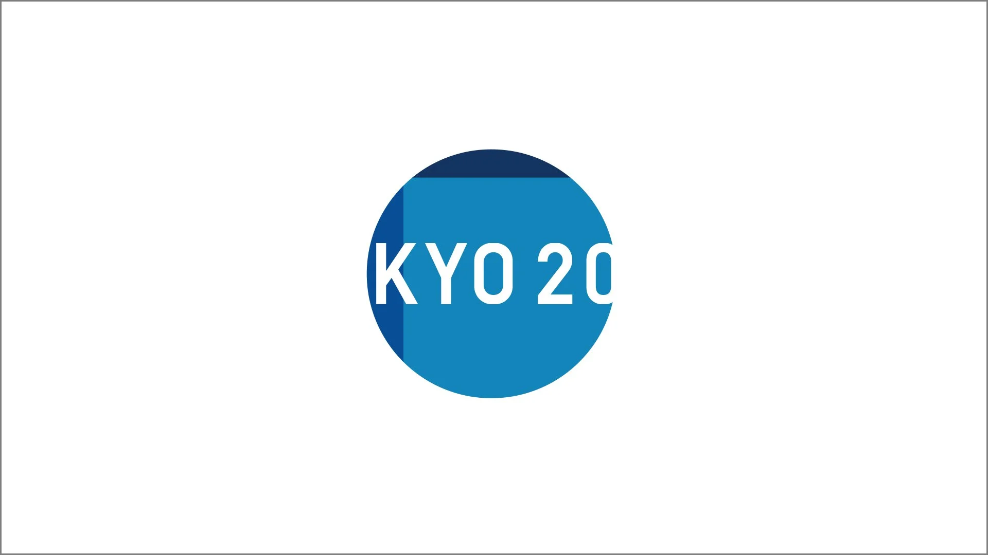
ID - Olympic Games Tokyo 2020 on TyC Sports
The Head of Promotions needed a brief yet impactful way to announce the event, with a preference for a purely graphic approach. Inspired by elements of Eastern culture, I conceived and executed this short promo while staying within the channel’s brand guidelines.
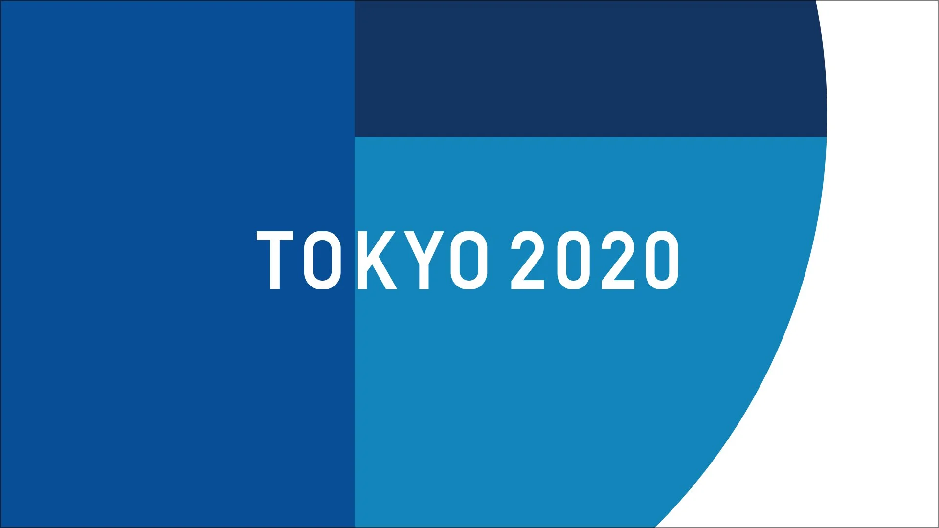
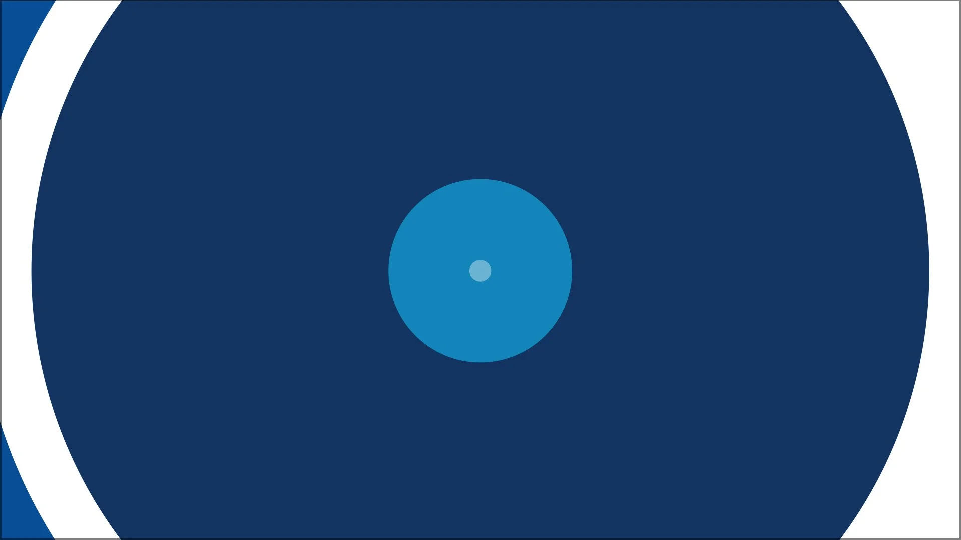
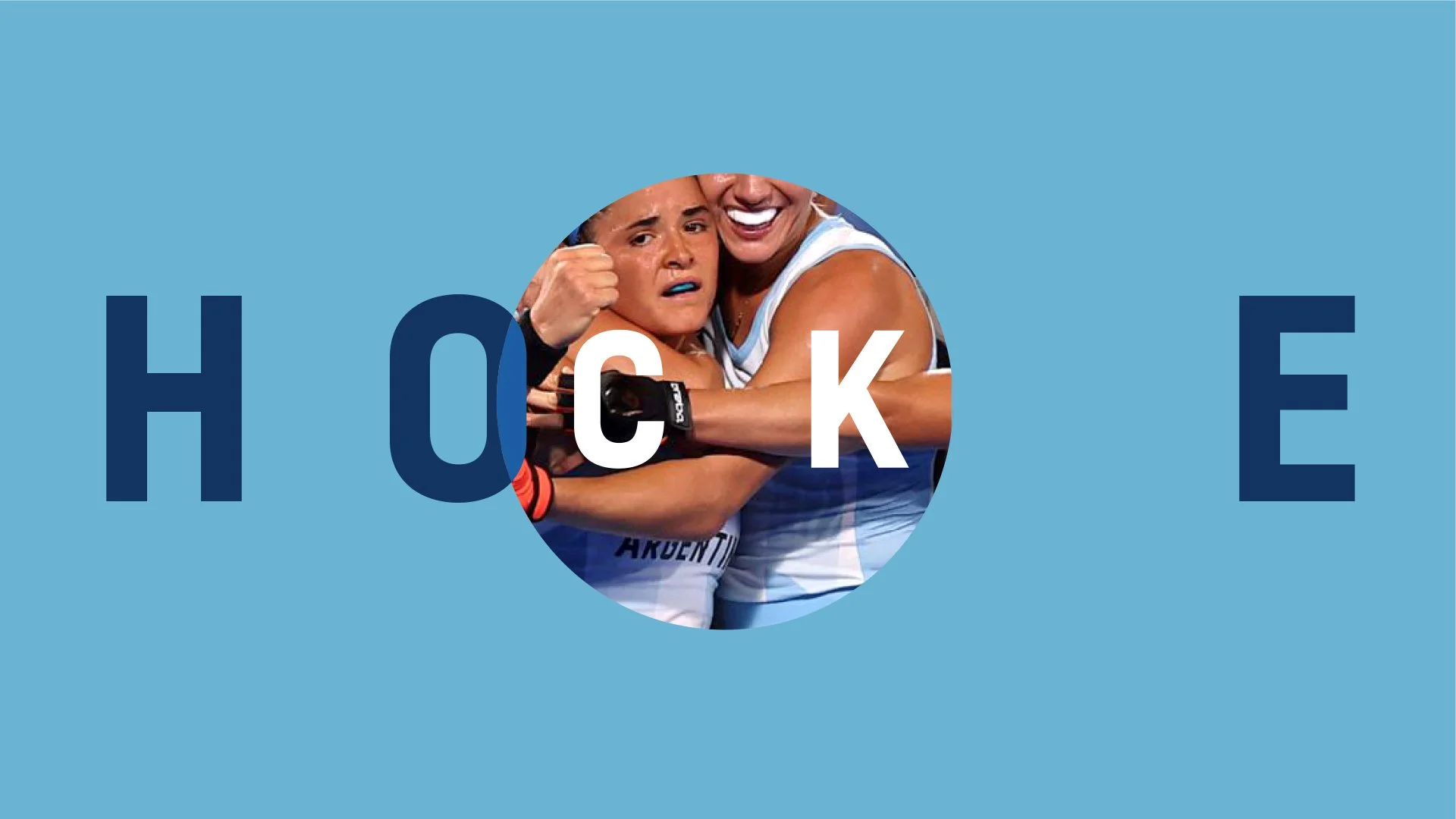
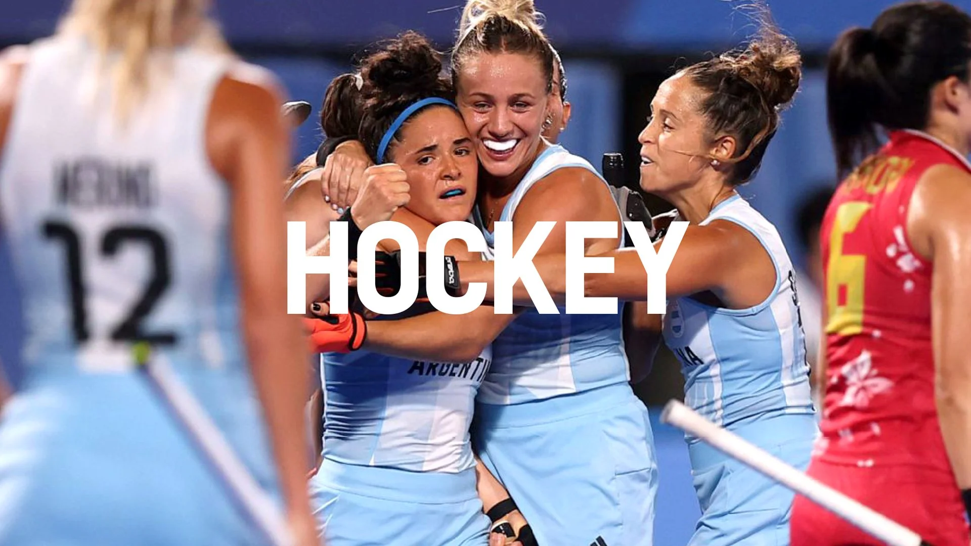
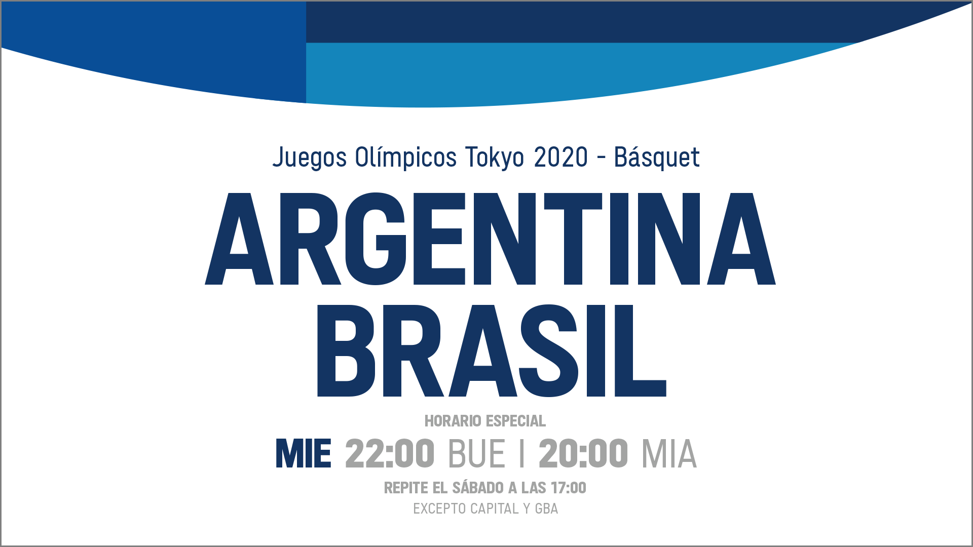
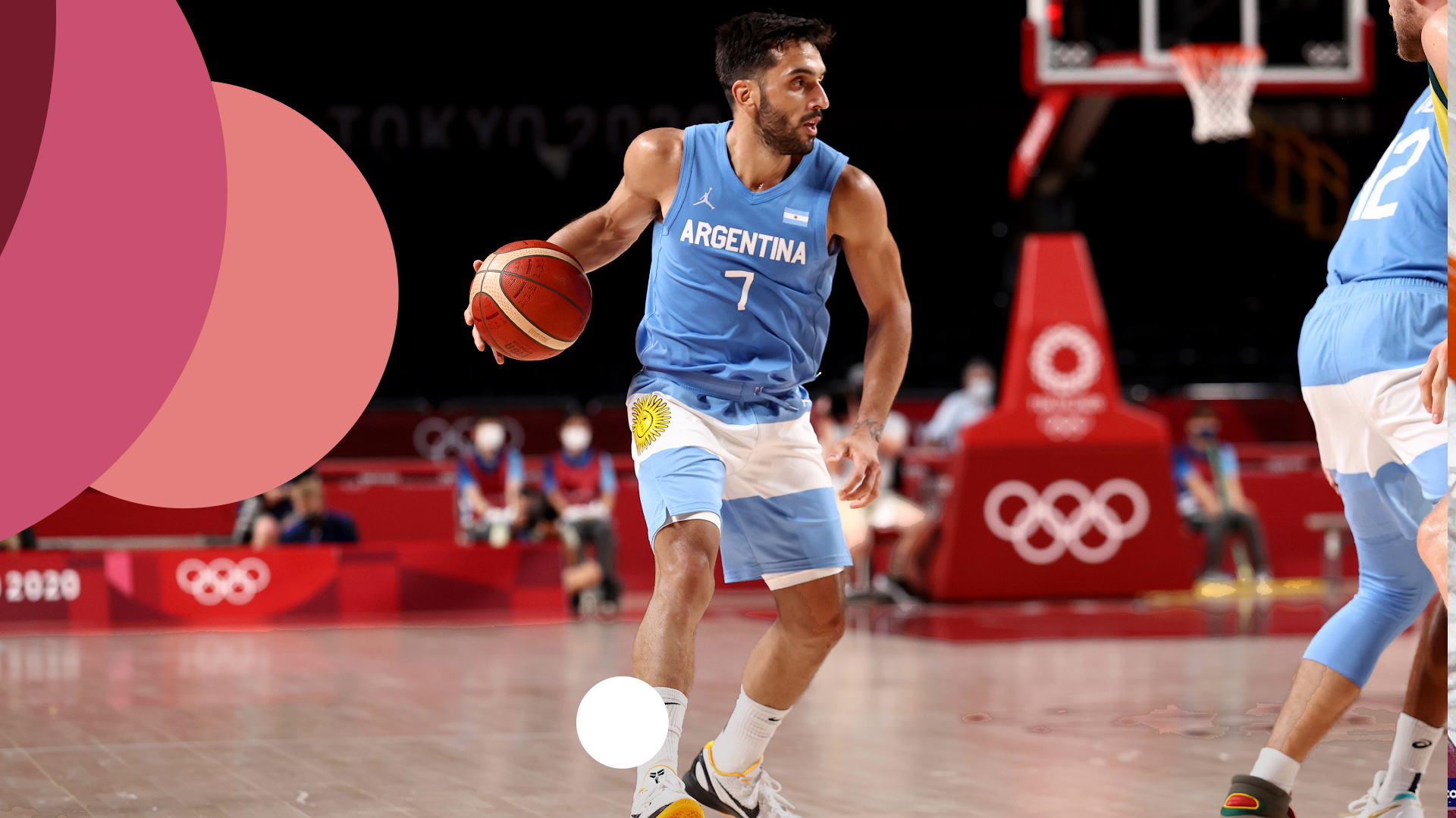
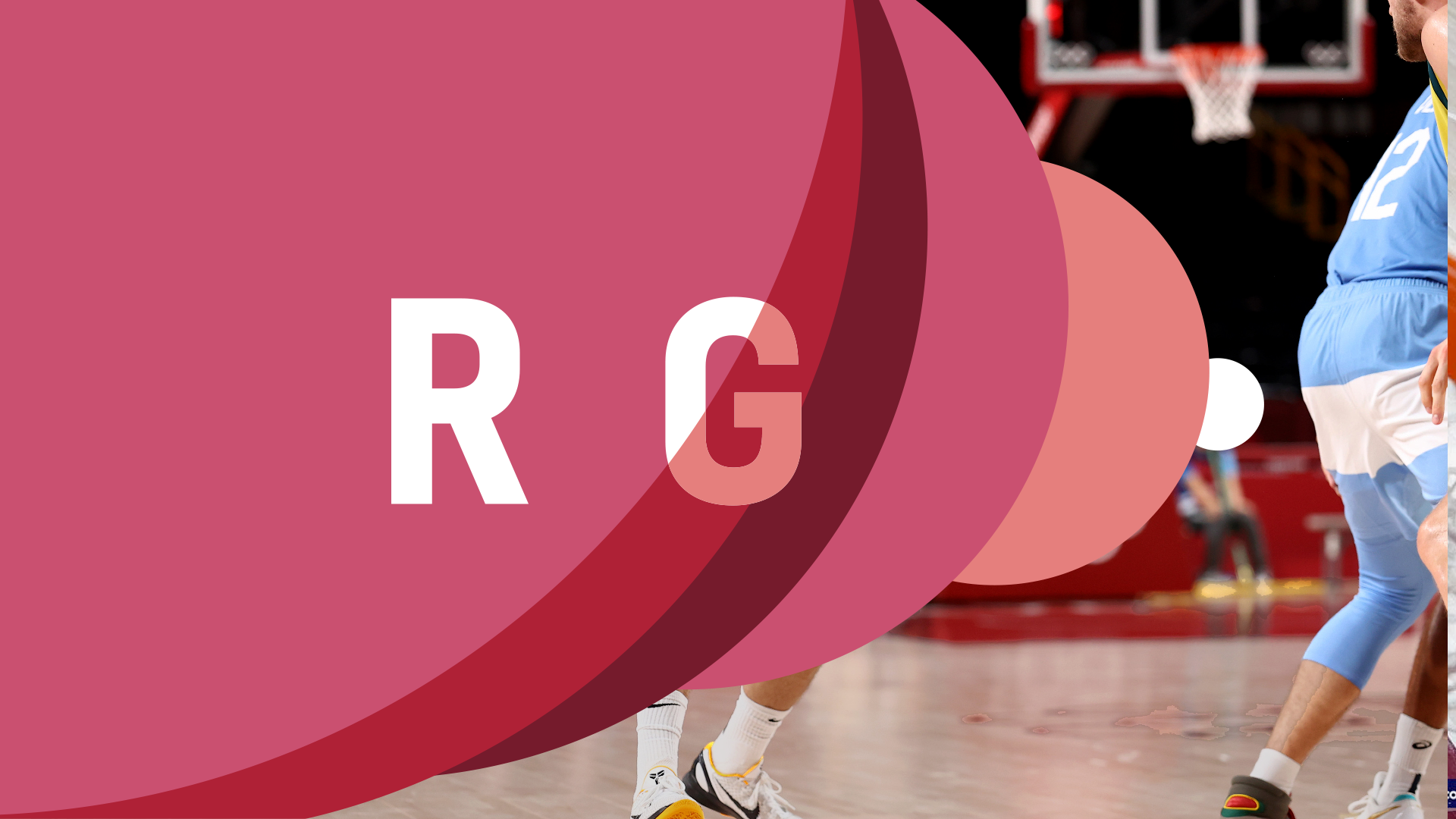
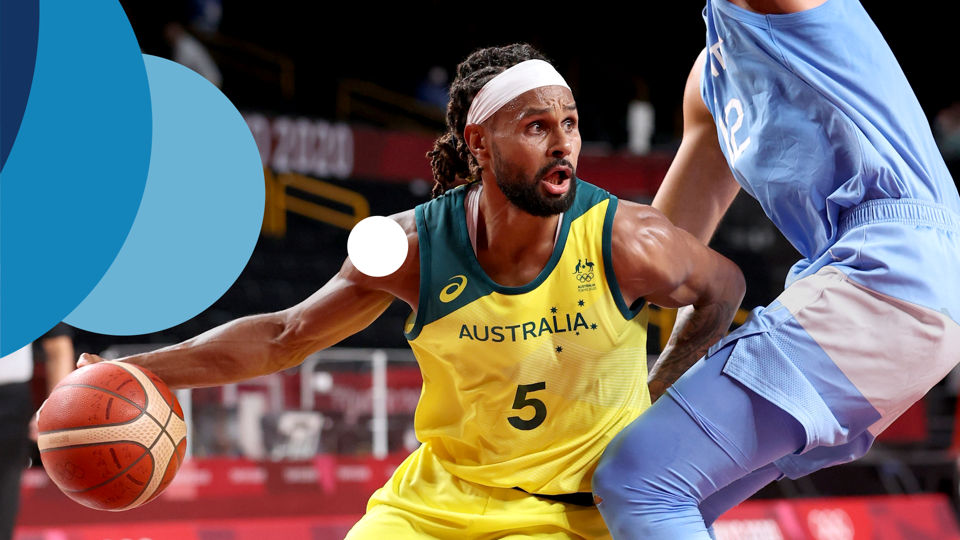
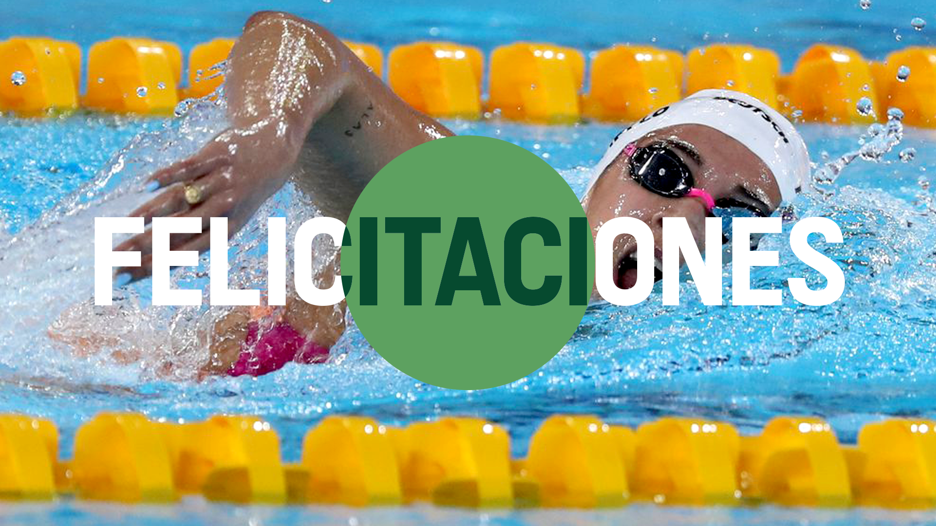
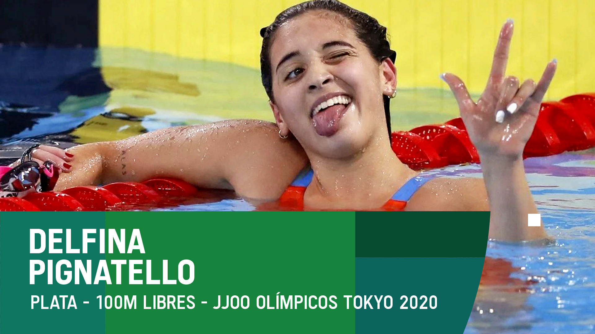
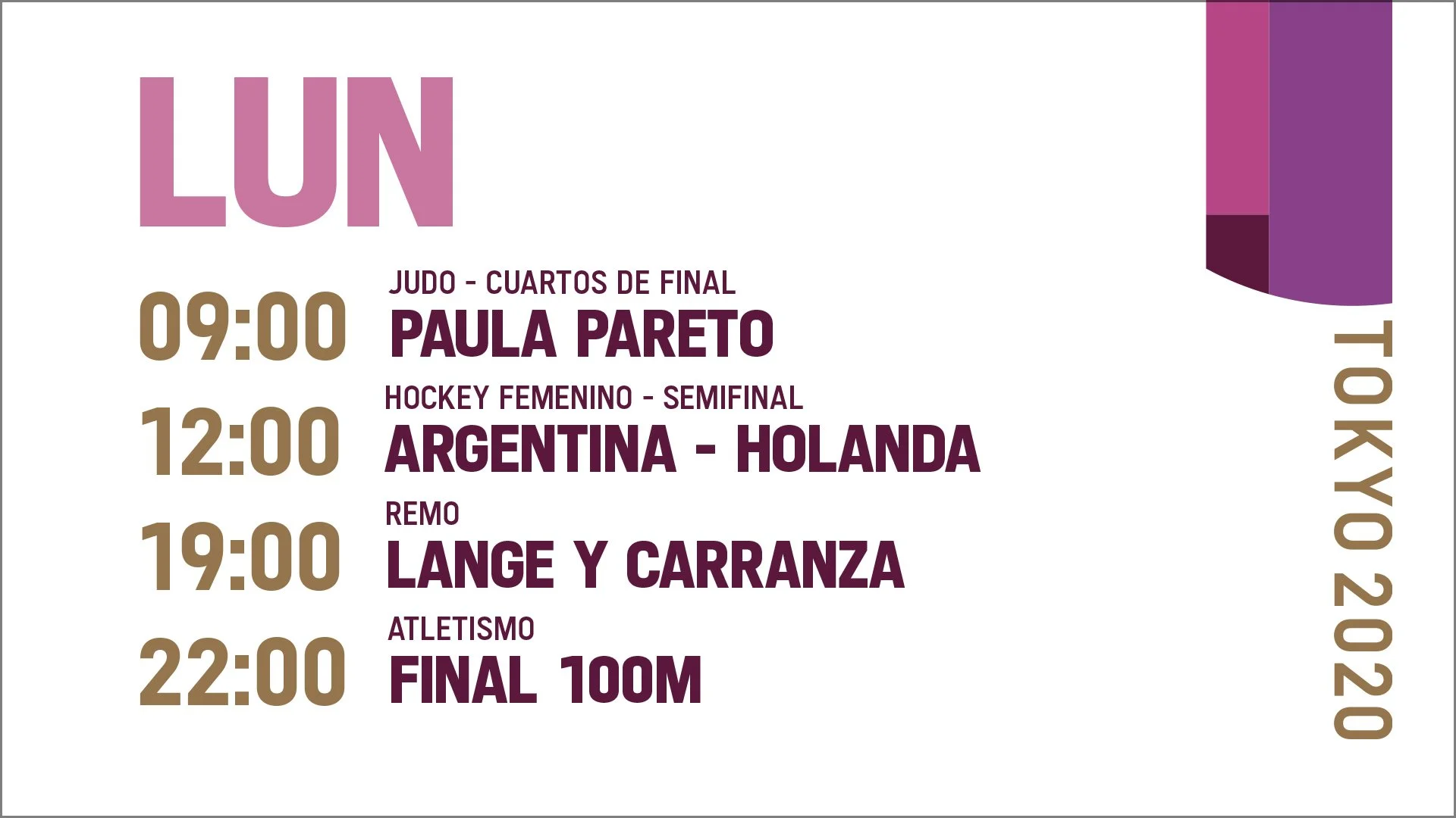
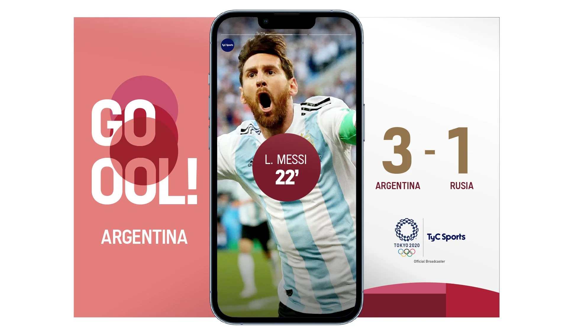
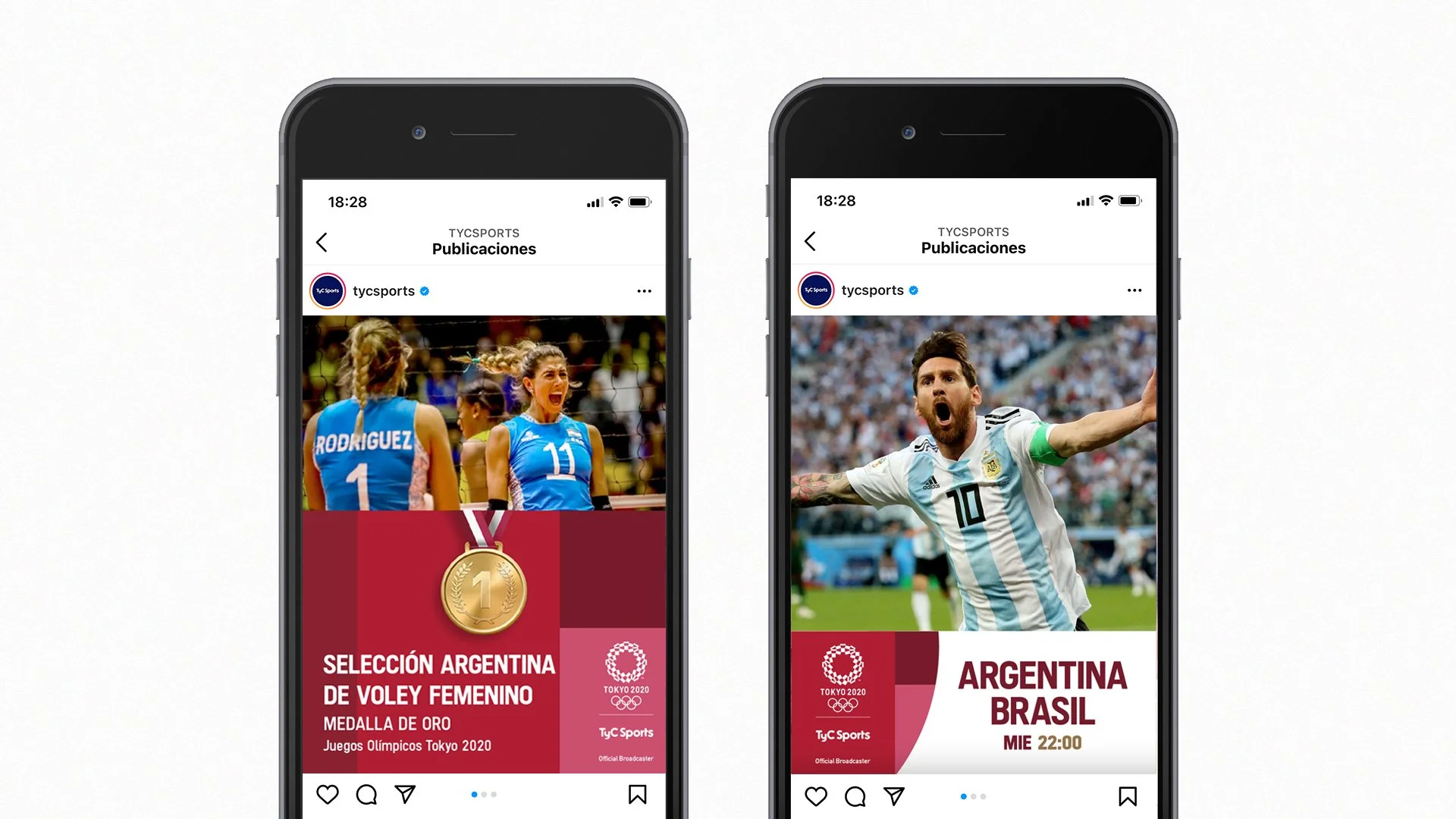
Promo Package & Social Media - Olympic Games Tokyo 2020 on TyC Sports
During the Games, we developed the full promotional package used to promote the different competitions across both on-air and social media platforms. The main challenge was finding creative opportunities while working within the strict event guidelines. Every piece required approval from the IOC, while also needing to reflect our own brand identity.
Inspired by the Japanese flag, I developed a circular graphic element that also referenced the ball used in many Olympic sports. This became the central narrative device throughout the entire on-screen package and communication system.
I believe the final result successfully captured the spirit of the Games while maintaining the channel’s visual identity.


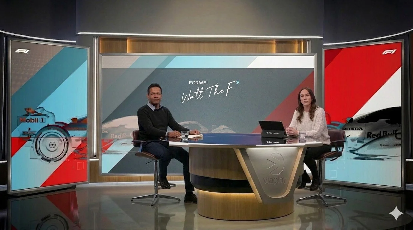
Visual Identity and Packaging - Formula 1 TV Show on Viaplay Sport News
In September, Viaplay launched eleven new sports programs for its sports news channel, and I was responsible for developing the visual identity for four of them.
For the Formula 1 show, the marketing and content teams wanted the visual focus to center around former Danish Formula 1 driver Jason Watt. Following the official Formula 1 visual guidelines, I developed a graphic package that highlighted Watt’s profile while also incorporating the identity of the different teams competing in the championship.
The goal was to create a package that felt dynamic, modern, and closely aligned with the high-speed atmosphere of Formula 1, while maintaining a strong editorial identity for the program.
Design Research Project - Media Design School
This project was developed for the Master of Design course Design Research at Media Design School during an intensive six-week period.
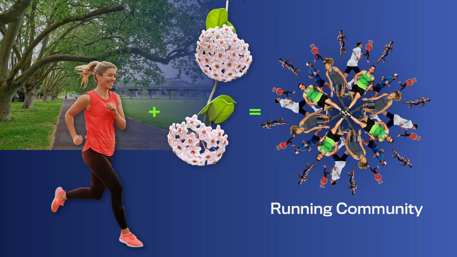
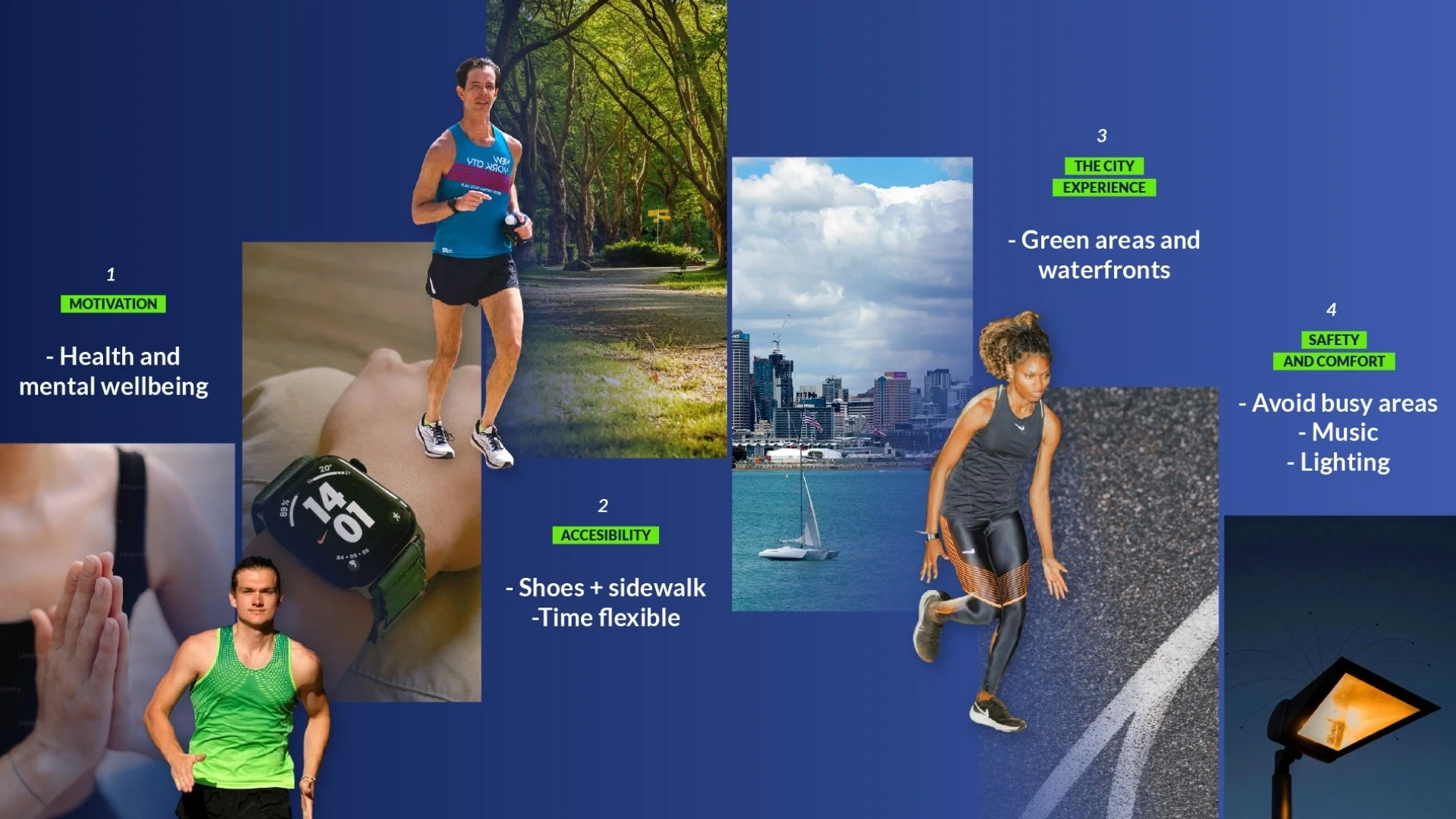
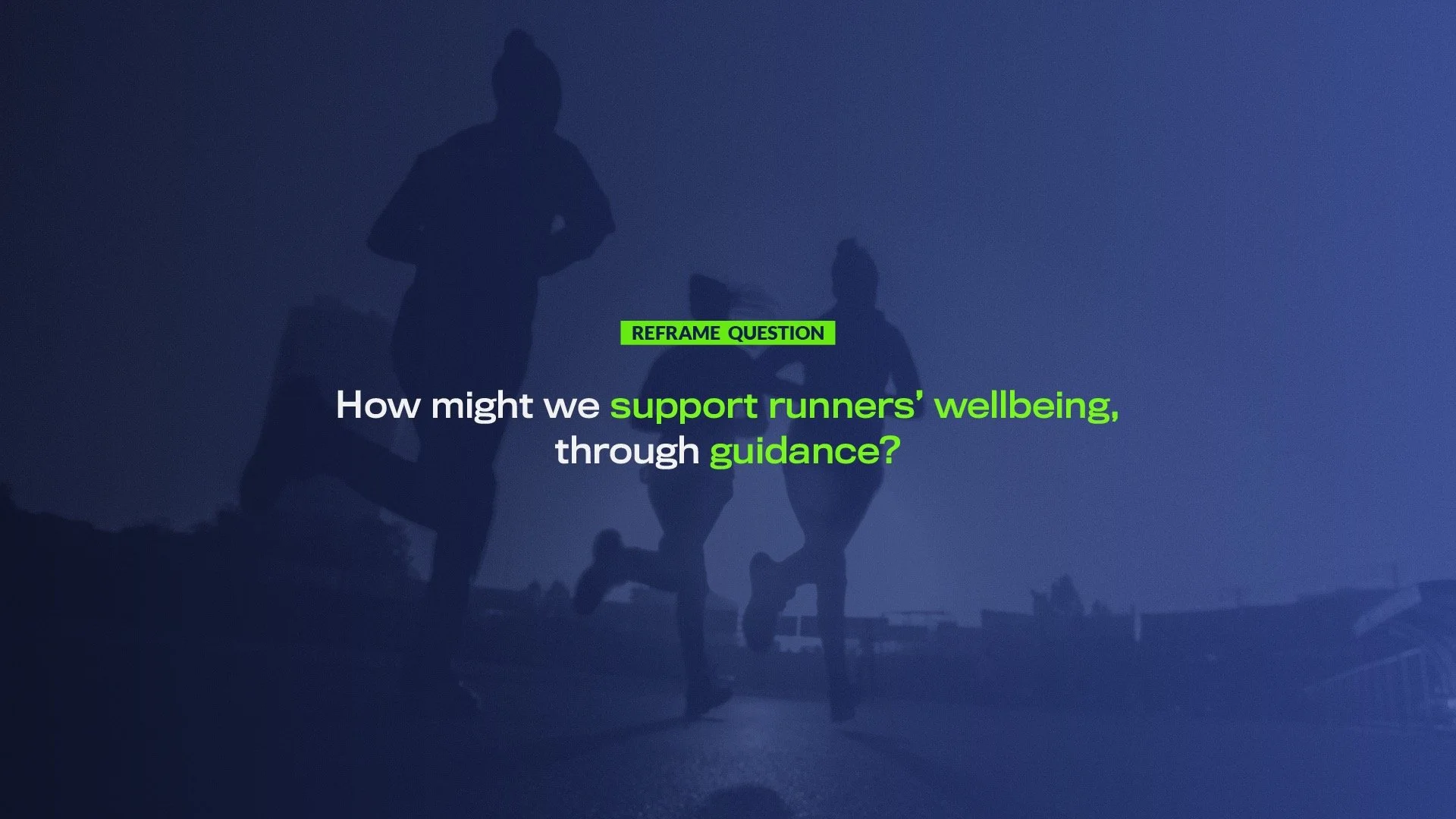
The challenge was to explore the human experience of movement and investigate how it could be improved through designerly approaches.
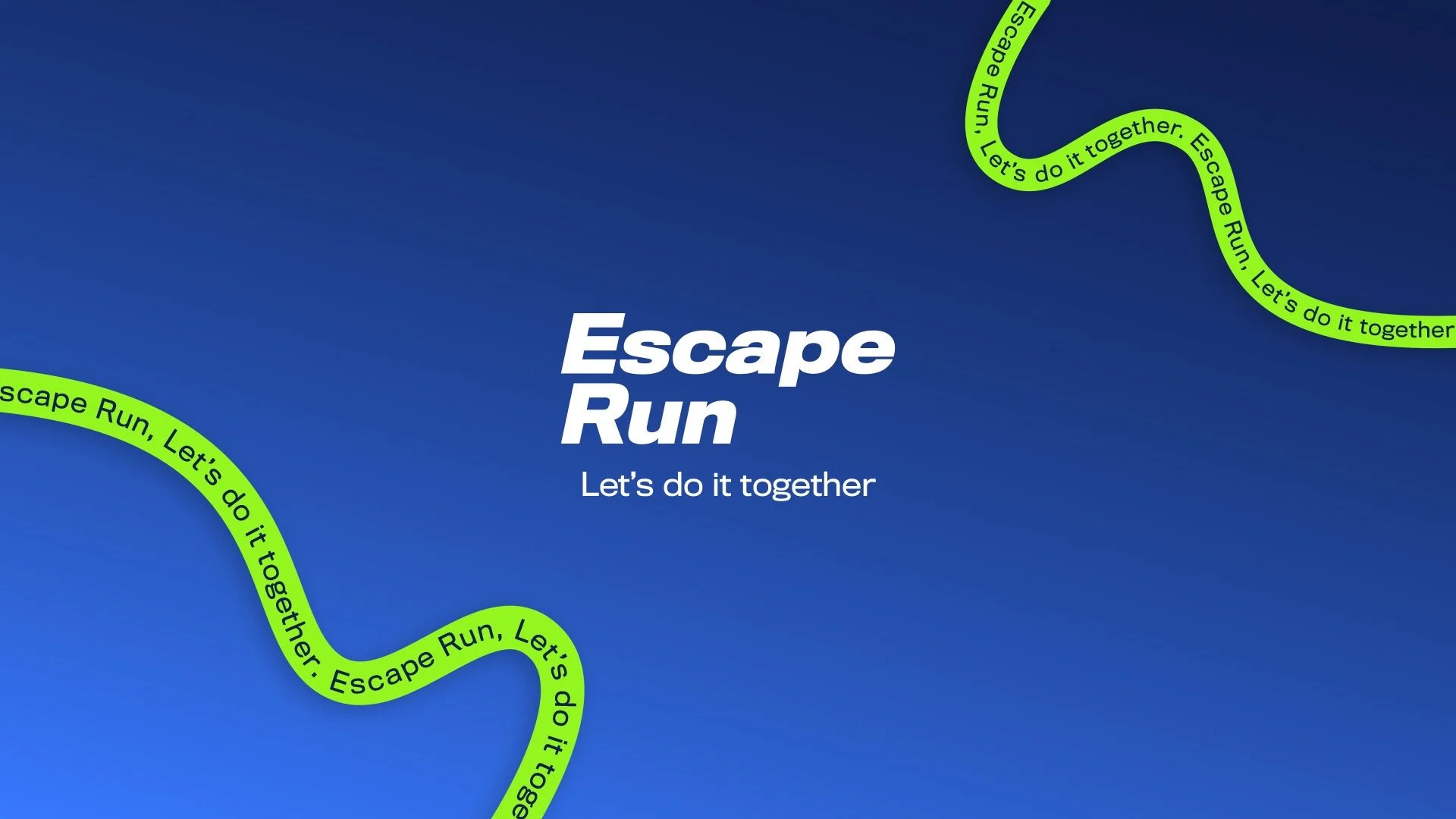
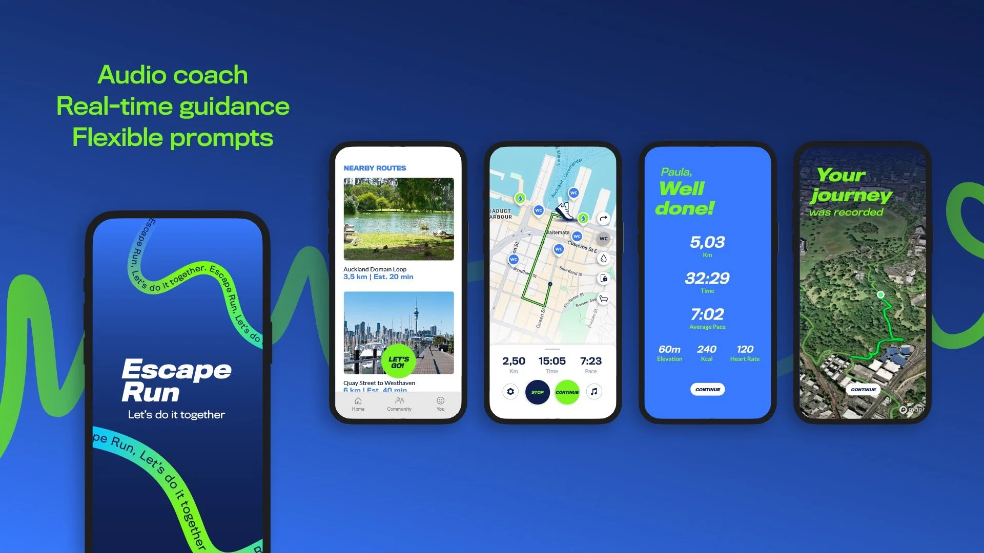
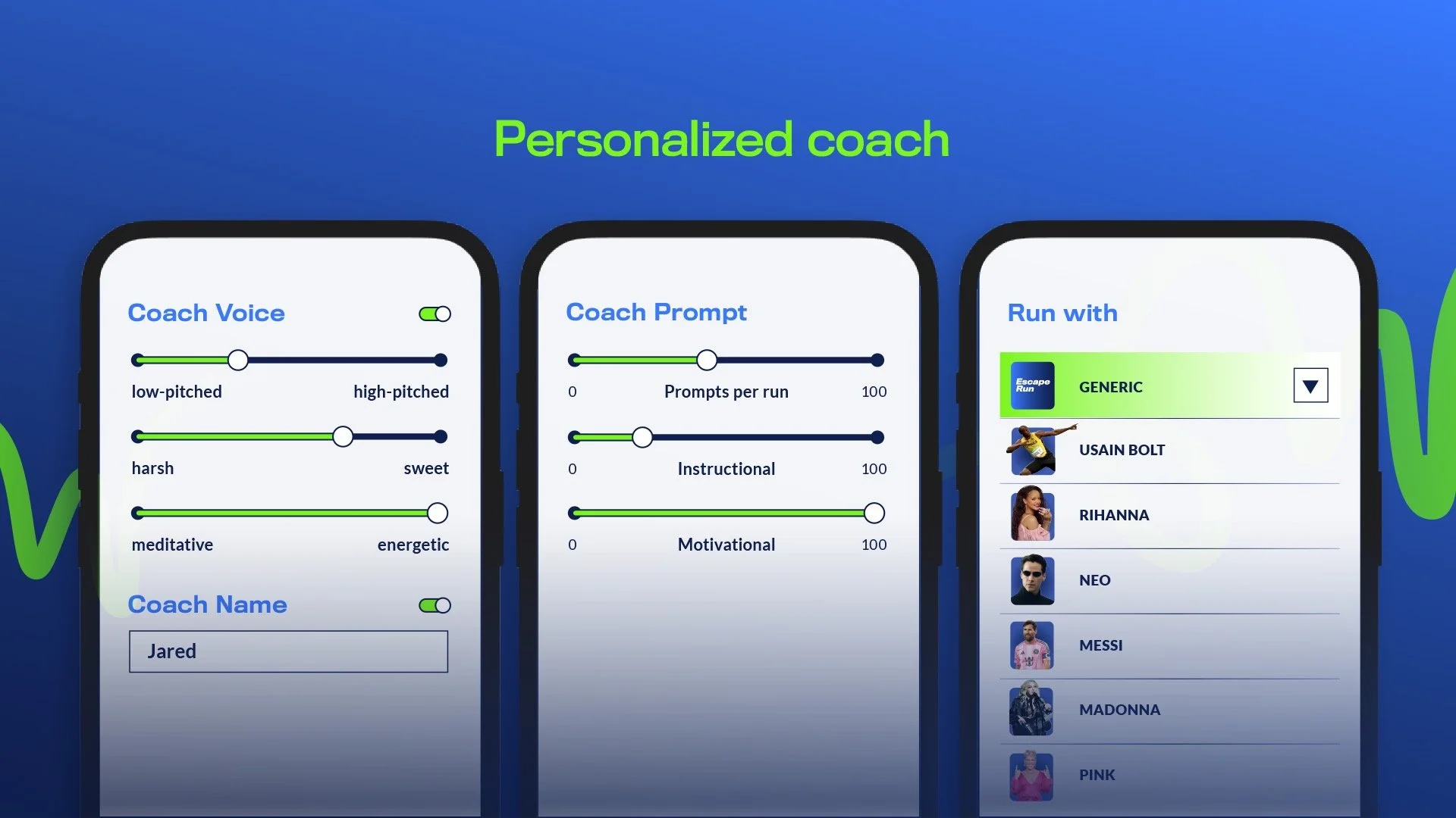
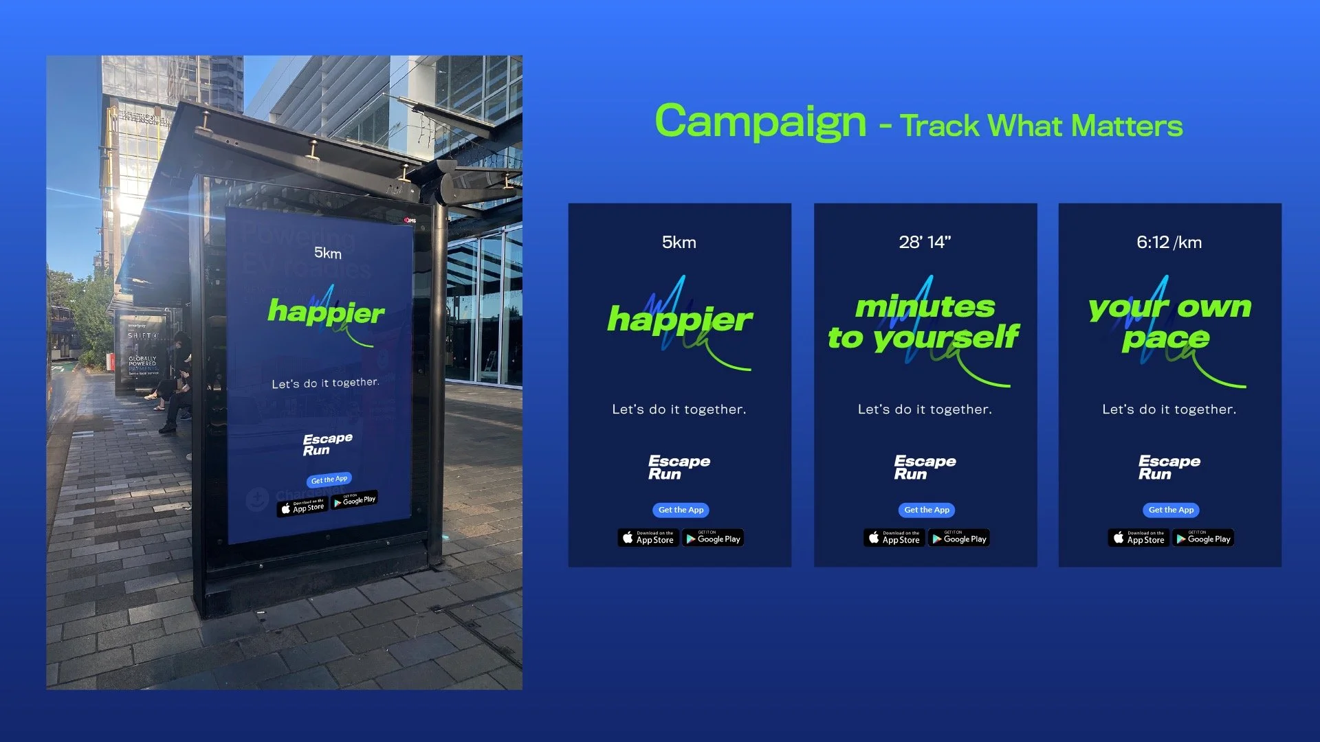
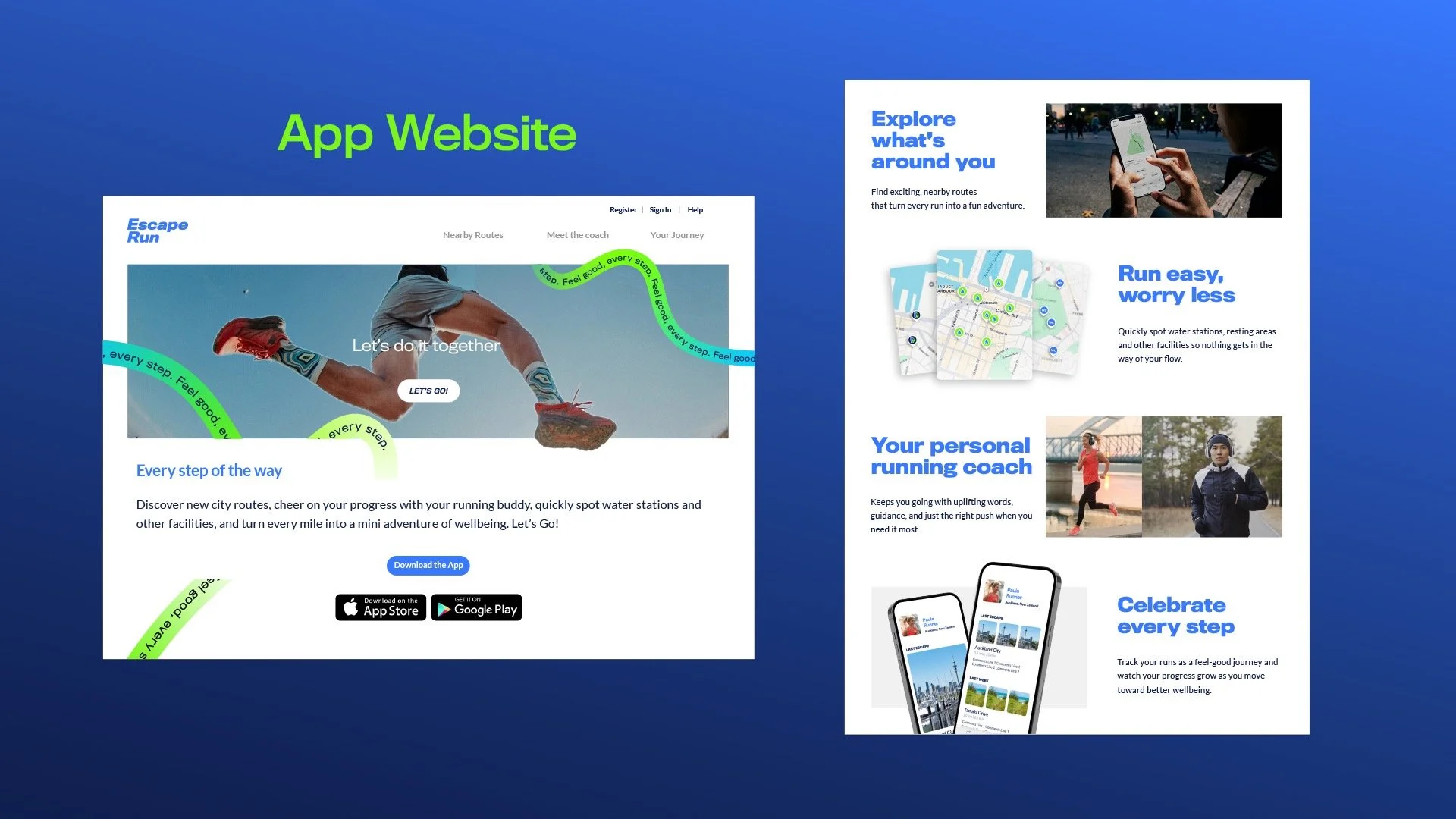
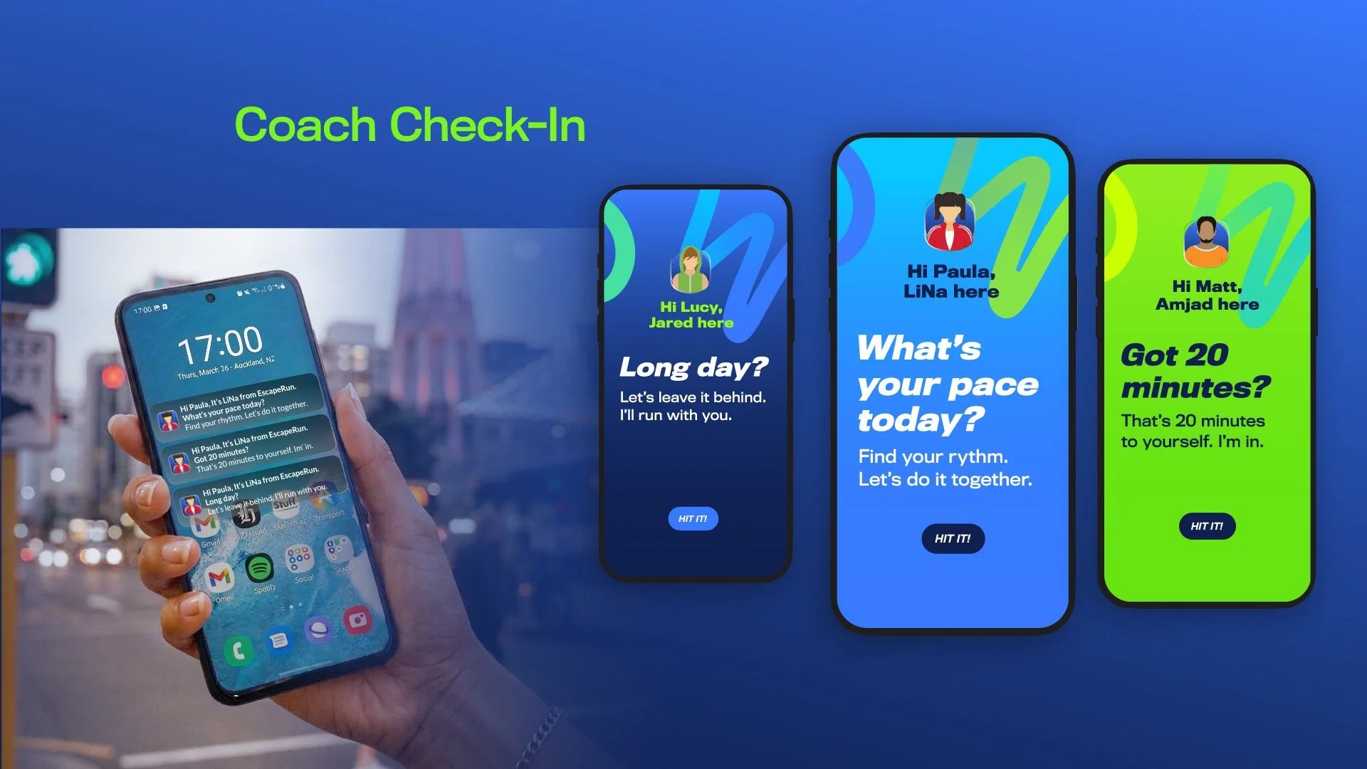
Inspired by conversations with friends in the running community, I developed Escape Run, a wellbeing-focused runners’ app prototype created in Figma. The concept centered around a personalized audio coach that allowed users to customize the tone, personality, and motivational style of their running experience.
Alongside the product prototype, I also created a basic campaign concept and explored how running could become a more supportive, engaging, and emotionally rewarding experience.
Although the project was developed in a short timeframe, it gave me the opportunity to step outside my comfort zone and explore a more research-driven and product-oriented design process.